An introduction to Alteryx Designer’s reporting tools
by Nathan Purvis
Background
Imagine this: you’ve finally finished building out your mammoth workflow and can’t wait to show your colleagues this brand new pipeline that’s going to save everyone X hours per month. However, just as you load up the results and start reaching for high-fives, Jim in the corner (who you don’t particularly like anyway because of his lacklustre secret santa efforts), starts complaining about the fact that ‘the data is still just in tables’ and ‘he was expecting more pretty pictures and charts’. What a killjoy, eh? Well, yes and no - Jim should definitely be putting more effort into his secret santa gifts, but he is right that we should try to present data as a chart or graphic when dealing with human end-users. In this blog, we’ll introduce a few basic tools from the reporting palette in Alteryx Designer that will help keep people like Jim on your good side! We’ll go through a short example, looking at storm data, and cover some of the key points and configurations.
The workflow
Below is an overview of the workflow. As an overview, we’re taking a dataset concerning Atlantic basin storms, picking out one to build a path/intensity map with and also isolating the first 5 in order to create a chart of their average wind speed. We then stick these elements together and output them to a PDF:

Now, as this blog is a focus on reporting tools, we won’t go into any actual detail of the other tools. However, if you’re wondering what is going on at any stage or would like to see a blog on, say, spatial tools, then please just reach out and I’d be happy to run through this!
First, we’ll start with the map that we’re building! It’s essential that, for tools that use positional/geographical data, we have spatial objects like Centroids, Lines and Polygons, that Alteryx can actually place on a map. Therefore in our input, we’ve isolated a single storm ([Serial_Num]), and plotted all of the latitude and longitudes associated with that as spatial points ([Centroid]), which we then feed into the Report Map tool:

You may have noticed the larger, grey input anchor here that we also see on tools like Join Multiple and Union - this is because we can feed any amount of inputs into the Report Map tool and use them all as different map layers.
Now, onto the configuration of the Report Map tool itself, we start off with the overall settings which give us control over surface level elements like size, scale and background. All I’ve changed here is the size (so I can fit all elements on a single PDF sheet at the end) and the background (as Alteryx will default to none - if you’re wondering where your map is!):

Next up is the ‘Data’ tab:

Here we set the ‘Spatial Field’ - the field we want Alteryx to plot for this layer, any ‘Grouping Field’ - if we want to make multiple maps for different, Alteryx will split the data and create one for each of the distinct values in this field, the ‘Thematic Field’ - any field we might want Alteryx to use to colour our spatial field, and finally the ‘Label Field’ - exactly what it sounds like; which field you want to use for labelling points/lines/polygons.
Depending on the selections made in the ‘Data’ tab, you’ll get different options in this next ‘Layers’ menu, but here’s what we can work with for this example:
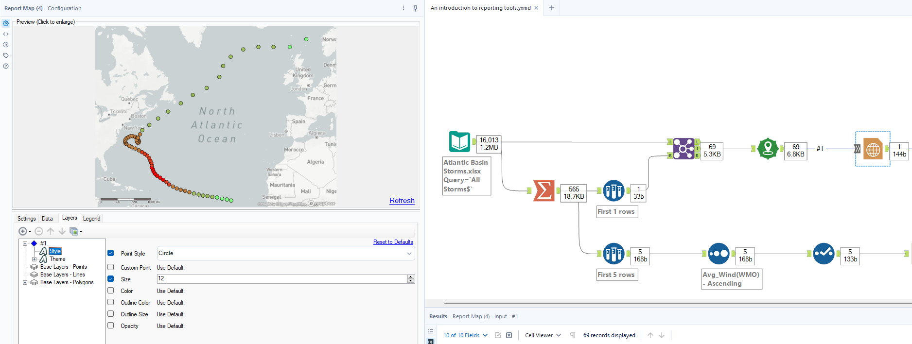
Within each data connection (which each represent layers), we can customise the appearance. In the ‘Style’ menu we can set basic elements like the shape, size and colour of the point. The cool part of this example is in the ‘Theme’ menu (which is available as we selected a ‘Thematic Field’ in the ‘Data’ tab), where we can tell Alteryx to assign a sliding colour scale to our points, based on their wind speed values (again, as we selected this as the ‘Thematic Field’. Here we want to range from green to red, depending on these values and so we use the following configuration:

The final part of the Report Map configuration is just making sure that we place a legend next to it for the benefit of our end user. No surprises here that we use the ‘Legend’ tab for this. Here, we have chosen to place it to the right:

The next tool we need to build out our view has limited functionality in comparison and is very simple to use and configure. The Report Text tool allows us to add bits of text to reports and we can either combine these with existing elements or have them as standalone parts. In our example, we’ll actually merge reporting elements by attaching the Report Text to our existing Report Map. This is used to add a very simple title/bit of introduction to the map itself:

As you can see, there’s an option to make this as a new field. However, if like us, you want to attach it to an existing field, you can nominate the position for this - we have placed it above. Within the text editor you can do the usual playing around with fonts, size, colours, adding hyperlinks/images and so on.
We now just need to create our second visual element for the report which is going to be a bar chart. To do this, we’ll want to use the Interactive Chart tool. An important note here is that - when you drag this onto the canvas - you need to run your workflow, as the metadata doesn’t automatically flow through here and you therefore can’t build until doing so. Within the tool itself, there’s a whole bunch of settings and customisations we can apply. To keep things simple, we’ll just go over what was used to create ours.
The first thing you’ll need to do for building any chart is adding a layer. After this, we set the chart type and assign fields to the axis as necessary:
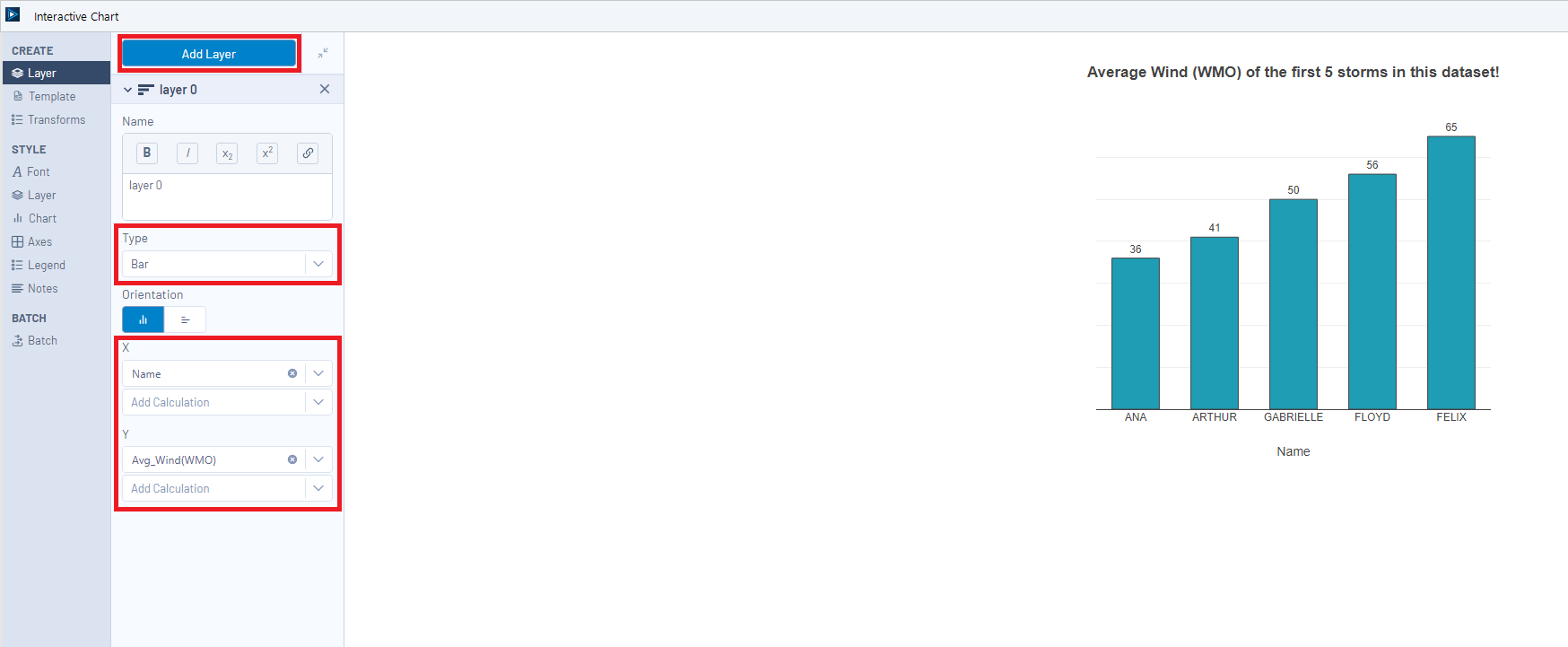
Within the pane on the left, you’ll see all of the various menus that we can use to format and transform our chart, most of which are fairly self-explanatory. For our chart here, we haven’t touched any font settings and the first changes we make are in the ‘Layer’ tab, where we altered the colour of the bars, added a small border, reduced the bar width and added each bar’s wind speed label:

Next, in the ‘Chart’ tab, we adjusted the size of our bar chart as part of iterating to find a layout that would fit a single PDF page. We also added a short title explaining what people are looking at:

Now, as I’m also a Tableau consultant and like to stick to visual practices, I have already stated the measure being shown within the chart in the title, and added the values as a number above the bar. Therefore, we can get rid of one of our axes to clean things up. Once again, no surprises that these settings are found in the ‘Axes’ tab:

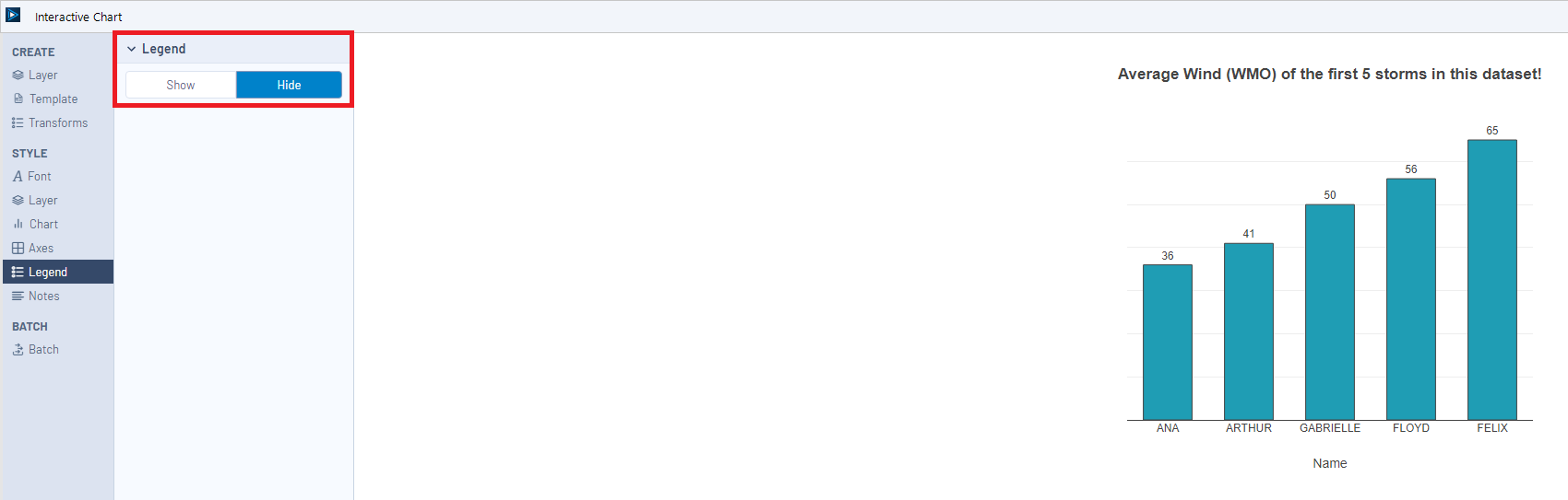
Just one more configuration and we’re done, promise! The last thing to do to our chart is just get rid of the legend that appears next to it as standard. To do this, you guessed it, we’ll go to the ‘Legend’ tab and just hit hide:
Once we have our multiple reporting elements, we now need to bring them together into a single view. To do this, we need the fields to be on a single line and so we need to conduct a join on record position. For our example, a standard Join tool is fine as we’re only consolidating two streams. However, if you’re dealing with more, you’ll want to use a Join Multiple. Now that everything is together on a single line, we employ the Layout tool to configure how we organise and position each of the elements. In this scenario, we’ll create a single-page PDF report with the map stacked and chart stacked vertically. Therefore, we use the following set up for our Layout tool, obviously selecting a vertical structure and then using the arrows highlighted in red to determine the position of each element. Where each item appears in the list is where it will appear in the vertical order. For Horizontal layouts, top to bottom represents left to right.

As shown in the image above, there’s also several other options for setting the size of the Layout and also adding things like borders and spacing between items should you wish to do so.
Now that we’ve finished building our report, the only thing left to do is write it as an output! Whenever we’re dealing with the reporting palette, we need to use a Render tool to do this, rather than a standard Output Data. By default, the ‘Output Mode’ will be set to a ‘Temporary PDF Document’, but the same option exists for other formats like Excel and Word documents. I’d recommend using these to iterate on your output in terms of sizing, spacing and any formatting.

Once settled on a look that we’re happy with, we can then elect to ‘Choose a Specific Output File’ which will make the ‘Output File’ configuration available; here we select a directory, filename and the file type of choice.

The rest of the configuration is fairly self-explanatory and is often just left as default, other than perhaps changing the paper style to allow the report to fit. In future blogs we will run through times we may want to use things like grouped reporting. But for now, when we go ahead and run our workflow, our beautiful PDF is created!

So there we have it, a quick introduction to the reporting palette in Alteryx and how we can use this to create simple but effective reports. As well as rendering, these can also be emailed out, but again, that’s for another blog! We really hope you enjoyed reading and, as usual, please do reach out if you have any questions, feedback or suggestions!